nsw.gov.au
Homepage and landing page design
nsw.gov.au is the main communication platform for the NSW Government, with the aim of creating a unified customer-centric digital experience for the people of NSW. I worked in the Optimise Squad at the Department of Customer Service, providing iterative platform-wide building blocks such as components, templates, and processes across the nsw.go.au footprint.
Homepage redesign
Task
During my time at DCS my team was leading the rapid evolution of componentry for nsw.gov.au. As we revised main landing pages new componentry was created and adopted.
Feedback from users pointed to decreased engagement because content felt inaccessible and too “governmenty”. So we set out to prove our hypothesis:
If we include content on the homepage using non-government UX patterns… then content will be more engaging and interesting to users… because the patterns are familiar to users from their general news and content consumption.
My role
As part of the process I:
reviewed customer behaviour, such as clicks and scroll behaviour, into the existing design
designed new components that were more visually engaging and similar to what customers were used to interacting with on other digital products
designed a new layout based on what customers needed to do with our content.
I conducted an A/B test of two design variants - one in the current format and the second designed with the new components similar to other consumer websites.
Outcome
Using Google Optimize and Google Analytics to compare how customers interacted with the page, we found page B performed better.
more users scrolled past 50% of homepage content
new components increased traffic to 'featured content' and 'media releases'
an improvement in customers clicking thumbs up, even though the same content was was surfaced on both A and B (i.e. the result is not reflective of the content featured, which could skew results).
New components created: side scrolling cards, feature block, latest news.
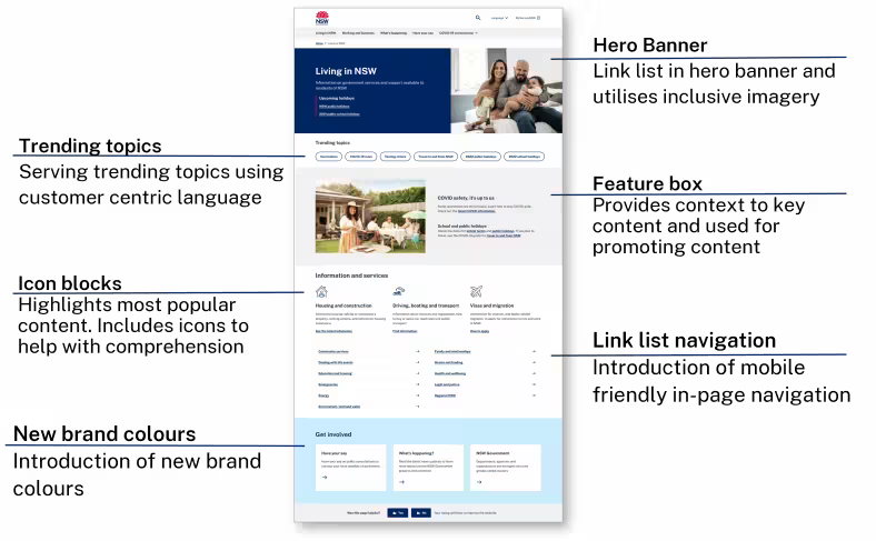
Living in NSW landing page
Task
“Living in NSW” covers a broad range of topics, relevant to all NSW residents. The previous version of the page was overwhelming and confusing and text-heavy. There were no visual elements to help users differentiate between sections. We did not set user expectations of where calls-to-action on the page would take them. The page required long scrolling on mobile devices.
Our three key goals were to:
highlight commonly searched terms
feature key content
make it easier to use on mobile devices.
My role
I used heat maps as part of the initial research to understand where customers were looking and clicking across the page. I learned which content captured attention, and what wasn’t working so well. Through analytics, we found that three topic areas accounted for over 70% of all page clicks, helping me to highlight content that was most important to customers on the page. The next step was to incorporate visual elements to the page to help set user expectations and create components that were more space efficient on mobile.
Outcome
The updated page now calls out the information that customers are most likely to search for and visit.
The trending topics module serves content based on customer trends. The tags use customer-centric language. This bridges the gap between official terminology and keywords people use when they are searching online. For example, ‘How strata works in NSW’ is more descriptive as a call to action versus the topic 'Strata'.
The research conducted by changing one page can benefit the rest of the website too. By knowing what worked on “Living in NSW”, we made similar improvements on the “Working and business” and “What's happening” pages.
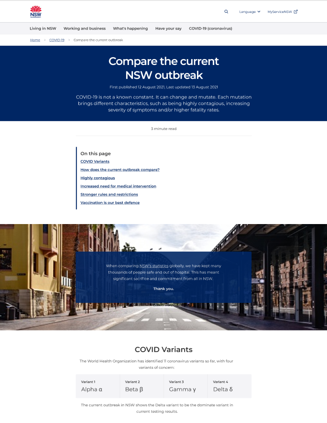
Visual editorial template
Task
The visual editorial template was created to give narrative structure to NSW Government content. Initiated by the COVID-19 Delta outbreak in 2021, the template applies storytelling to push beyond general trends in government messaging and connect with users.
My role
This project was rapidly prototyped within a collaborative team environment in response to a ministerial request. Working in a team directly with a BA and developer, I worked on developing the narrative structure, synthesizing existing content to layer meaning into simple formats, and creating clear in-page navigation paths.
Outcome
The creation fo this template added functionality and components to nsw.gov.au for other areas to use including parallax image scrolling, three quarters centred section, long form content, and data visualisations modules.
Post COVID this template has been used to mark the passing of Queen Elizabeth II and New Years Eve events.
This template was also used to inform the NSW State of the Customer content microsite.